eCommerce Website +
Email Flow Revamp
Boosting conversion rates and driving sales growth through improved user experience, visual consistency and brand identity.


MY ROLE
I worked on the UX/UI design process such as conducting research and analysis, reviewing customer journeys and user flows, creating mockups and managing project timeline. I also collaborated closely with the Head of Design who provided the overall branding and art direction, and coordinated with the freelance developer to ensure quality assurance before the website went live.
DURATION
March - May 2023
BACKGROUND
Glow Hub is an emerging skincare brand launched in July 2020 with its Direct-to-Consumer (D2C) ecommerce model on Shopify. Targeting the Gen Z and Alpha generations who are looking for affordable yet high-quality skincare options, Glow Hub products are designed to be mixed and matched based on specific skin issues, providing straightforward and ingredient-focused skincare routines.
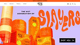
In Spring 2023, Glow Hub had a rebranding on all products packaging. To match their fresh new look, the website was also revamped to ensure a cohesive brand experience that resonates with their young and style-conscious customers.
THE PROBLEMS
-
Glow Hub is a Shopify website and has added numerous third-party apps to support customised functions. The lack of a dedicated review of UX/UI problems has caused these issues to accumulate over time without resolution.
-
Inconsistent content such as discrepancies in ingredient information and cluttered UI has made it challenging for users to get relevant product information.
-
The site loading time was slow which frustrated users and increased bounce rates.
-
We have some Klaviyo email flows implemented but they have not been thoroughly reviewed. The team is uncertain about the email marketing effectiveness.
THE GOALS
-
Conduct a comprehensive UX/UI review to address all existing issues and fix them. Optimise images and third-party apps to reduce load times.
-
Revamp the UI design to align with the new packaging and enhance brand recognition. Implement a consistent design system across the site.
-
Review all existing Klaviyo email flows to identify weaknesses or outdated content. Consider each flow's relevance to current customer behaviours and business objectives.
-
Increase customer engagement and conversion rate.

My Role
Solely responsible for all the hands-on UX/UI end-to-end design process, from initial concept to design implementation. Aaaaaaaaa aaaaaaaaaaaa aaaaaaa aaaaaaaaaaaaaa aaaaaaa aaaaaaaaaa aaaaaaaa aaaaaaa aaaaaaaaaa aaaaaaa aaaaaaaaaa aaaaaaaa
Date
May - August 2017
DESIGN PROCESS
Openrice was initially launched in Hong Kong in 1999 as a local web dining guide, and later developed into a one-stop online platform (web and app) with various dining features, such as restaurant reviews, photo uploads, reservations, discount vouchers, etc. Nowadays OpenRice has over 20,000 recorded restaurants and 5.4 millions registered users. It’s the #1 most popular dining platform in Hong Kong.
Openrice Biz was launched in 2016 as a B2B merchant platform specially developed for restaurant owners and employees. The Merchant App (MA) aims to be a one-stop management tool for all daily restaurant tasks, helping restaurants with their digital transformation need.
RESEARCH & ANALYSIS

It is crucial to consider that all features can be subscribed to separately. Therefore restaurants need to be clearly informed about which features they have subscribed to or which have expired. A promotion section for new features should be included as well.
COMPETITOR ANALYSIS
A competitor analysis helped us understand the target audience, branding and content strategy of similar brands in the market. We could examine how competitors address the needs of Gen Z and Alpha generations through features like personalised recommendations, educational content and social proof. By assessing their UX/UI design, we could then uncover opportunities for differentiation and enhancement in areas like engagement, conversion rates and brand loyalty.
Tech’s Perspective : Confusions on IA, user roles, and notifications settings.

“KNOW YOUR USERS”
It's essential to understand the evolving needs of our target customers of Glow Hub — Gen Z and Alpha generations. While some persona workshops and user interviews were already conducted during the initial website launch in 2020, the rapid pace of change among the young generation may require us to update our insights more often. Gen Z users are overwhelmed by the abundance of skincare information these days and require more educational content to guide their purchase decisions. They are drawn to clean, minimalist designs with trendy colour palettes like soft pastels, vibrant neons and muted tones. They also value social media integration for seamless sharing, and demand diverse and inclusive representation in the brand's identity.
Tech’s Perspective : Confusions on IA, user roles, and notifications settings.


DATA ANALYTICS

Analytics data from Shopify, Klaviyo, Google Analytics, and Hotjar give us a comprehensive understanding of user behaviour on our eCommerce website.
Some key metrics includes:
Shopify: Sales performance, customer purchase patterns, Product popularity.
Klaviyo: Email engagement, impact of marketing campaigns on customer retention and repeat purchases.
Google Analytics: User demographics, traffic sources, user flows and navigation.
Hotjar: Heatmaps, session recordings.
We used these data to determine what contents to be included on the homepage. What are the most common skin concerns among our customers? Which collections are viewed most? How can we show them by order of customer interest? By integrating these data sources, we can make informed design decisions that enhance usability and increase engagement.
IDEATE & DESIGN

Insights :
Action taken the most : Create booking offer / Create coupon / Verify diner’s offer (scan QR code)
Action taken the least : Check inbox / notifications
UX/UI AUDIT
In my UX/UI audit, I identified several key issues that could undermine the user experience and brand perception of the website, some examples include:
-
Slow Load Times: Large image files are causing delays and making the site less responsive.
-
Inconsistent and Cluttered UI: Images are displayed at varying heights, and ingredient icons are not uniformly sized, leading to a visually disjointed experience.
-
Unclear Call-to-Actions (CTAs): The sold-out button is not visually distinct from the standard buy button, causing potential confusion for customers.
-
Quiz Results: The user interface is broken with text misalignment, which disrupts the readability of the result.
-
Currency Issue: Text disappears when hovered over, leading to a frustrating experience when users try to view prices in different currencies.
These seemingly minor issues can collectively impact the brand's reputation by discouraging user trust and satisfaction. It's essential to address these problems and ensure a polished, professional experience that reflects the brand's values and commitment to quality.
To help the development team understand all user permissions, we created a specification document summarising all interactions and permissions for these three roles. This document also facilitated discussions on any constraints we needed to consider when designing the final UI.

UI LIBRARY
A UI library provides reusable design components that ensure consistency and efficiency across our site. We have centralised elements like theme colours, ingredient icons, footer branding stripes, button styles etc in a library file. This allows the entire team to easily reuse and manage these components, streamlining the design process in the long-term.
USER FLOW
We’ve integrated Klaviyo for our email communication with customers but it seems we haven’t fully utilised its capabilities. I conducted a comprehensive review of our existing flows to identify gaps for improvement. I also mapped out the entire user flow between our D2C storefront, Shopify backend, and Klaviyo. These visual representations enhance our understanding of the journey details, making it easier for all departments to grasp and align with our communication strategy.

In addition to refining existing flows, I developed new automated notifications to enhance operational efficiency and customer experience. For example, alerts for customers when a product is back in stock, and low inventory notifications for the warehouse and internal teams.


DESIGN MOCKUP
I collaborated closely with the Head of Design who established the overall brand direction for the website revamp. The main theme colour palette and font styles were originated from the rebranded product packaging. Then I translated these brand elements into the website's visual and worked out the design details in Figma, focusing on bringing the creative concepts to life and ensuring that the final designs were optimised for a seamless handoff to the freelance developer.


PROJECT PLANNING
Given the tight deadline to complete the project, I took on the sole responsibility of managing the website launch to ensure that every aspect was delivered on time. The project was divided into 3 phases:
UI Fixes (Pre-Launch):
Identified and resolved all UI issues which do not affect the overall brand experiences.
Post-Launch Enhancements:
Following the launch, we worked on implementing additional “nice-to-have” features which further enhance brand identity.
Main Rebrand (Hard Deadline):
Focus on the technical execution and worked closely with developers to integrate the new design elements into the website. Conducted thorough testing across various responsive views to guarantee the site’s functionality on all devices.


After the launch of the website revamp in Apr 2023, Glow Hub has seen impressive improvements in key performance metrics. Increase of visitor numbers and sessions indicating heightened user engagement, while the conversion rate saw a significant boost of 55%. The most striking result is the sharp increase in online store sales, which jumped by 122% between Q1 and Q2 and saw an overall YoY growth of 245% compared to 2022.
RESULT
Tech’s Perspective : Confusions on IA, user roles, and notifications settings.
View More Works
Revitalising the brand Identity and enhancing digital presence with a modern UX/UI approach.

Redesigned the one-stop restaurant management app, contributing to a 116% increase in restaurant subscriptions.

Merging legacy systems with modern solutions to elevate restaurant management to the next level.
