
Amelia Knight Website Redesign
Revitalising the brand Identity and enhancing digital presence with a modern UX/UI approach.


MY ROLE
I’m responsible for overseeing the end-to-end process from gathering requirements and creating the site’s IA, to designing wireframes and implementing the final design using Wix Studio. I collaborate closely with the head of design, marketing and sales teams to ensure all visual elements like typography, imagery, layouts, etc, are consistent, modern and reflect the new company identity.
DURATION
December 2023 - February 2024
BACKGROUND
Amelia Knight Limited is a leading private label cosmetics manufacturer in the UK, specialising in designing, developing and producing a wide range of makeup and skincare products for global markets. Catering to both private brands and mass-market retailers, the company is known for its custom formulations, ethical practices and cruelty-free production. They deliver innovative solutions to meet the evolving needs of consumers.
Their official website was built on Wix some years ago, and had become outdated in terms of both visuals and content. In February 2024, with the team preparing to participate in an international cosmetics conference, the urgency for a complete website redesign became inevitable. The goal was to modernise the site to attract and engage international customers during the event.
THE PROBLEMS
-
The previous website features old imagery and an outdated style that does not align with current brand values or trends. Some company information is no longer relevant too.
-
The overall website content does not fully reflect the complete range of services offered by the company.
-
There’s only one general contact form included in the website, which makes it difficult to streamline inquiries from different types of clients
THE CHALLENGES
-
The end-to-end redesign process must be completed in just 1.5 months to coincide with the hard deadline of the event date.
-
Collecting the necessary information from various departments has proven difficult as teams are unsure of what content is needed or prepared. We need to provide guidelines on what assets would be aligned with the new brand identity.
THE GOALS
-
Revitalise Brand Identity: Modernise the website's design to better reflect Amelia Knight's reputation as an innovative, ethical cosmetics manufacturer.
-
Professional and Trendy Aesthetic: Create a more visually appealing, trendy and informative site that strengthens the company's market position and builds credibility.
-
Appeal to International Business Clients: Ensure that the redesign speaks directly to a global audience of business clients attending the international cosmetics conference.

My Role
Solely responsible for all the hands-on UX/UI end-to-end design process, from initial concept to design implementation. Aaaaaaaaa aaaaaaaaaaaa aaaaaaa aaaaaaaaaaaaaa aaaaaaa aaaaaaaaaa aaaaaaaa aaaaaaa aaaaaaaaaa aaaaaaa aaaaaaaaaa aaaaaaaa
Date
May - August 2017
DESIGN PROCESS
Openrice was initially launched in Hong Kong in 1999 as a local web dining guide, and later developed into a one-stop online platform (web and app) with various dining features, such as restaurant reviews, photo uploads, reservations, discount vouchers, etc. Nowadays OpenRice has over 20,000 recorded restaurants and 5.4 millions registered users. It’s the #1 most popular dining platform in Hong Kong.
Openrice Biz was launched in 2016 as a B2B merchant platform specially developed for restaurant owners and employees. The Merchant App (MA) aims to be a one-stop management tool for all daily restaurant tasks, helping restaurants with their digital transformation need.
Previous Amelia Knight Website

RESEARCH

It is crucial to consider that all features can be subscribed to separately. Therefore restaurants need to be clearly informed about which features they have subscribed to or which have expired. A promotion section for new features should be included as well.
GATHERING REQUIREMENTS
The first step involved discussions with key stakeholders, including the sales, marketing, and NPD teams, to understand their needs and goals for the redesigned website. We evaluated the existing website to determine which elements should be retained and identified areas for improvement. The marketing team has also provided a draft document with content copy, serving as a foundation for the new site’s direction and structure.
Tech’s Perspective : Confusions on IA, user roles, and notifications settings.
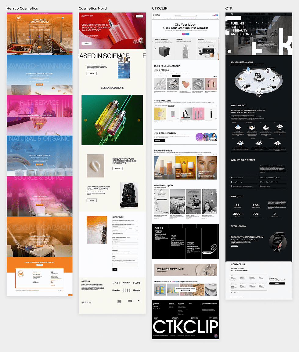
COMPETITOR ANALYSIS
I worked with the Head of Design to conduct a competitor audit in order to assess key functionalities and best practices used by competitors in the cosmetics/skincare sector. We focused on websites of international companies and private-label manufacturers to identify strengths and weaknesses in their design, user experience and content presentation. This audit provided insights into industry trends and also helped us benchmark the brand's identity against competitors.
Tech’s Perspective : Confusions on IA, user roles, and notifications settings.
IDEATE & DESIGN

SITEMAP
After gathering the requirements, we designed the sitemap to structure the website content logically. This involved organising pages for key company information, services, products, contact, etc. We hope the new navigation helps customers access crucial pages easily.
To help the development team understand all user permissions, we created a specification document summarising all interactions and permissions for these three roles. This document also facilitated discussions on any constraints we needed to consider when designing the final UI.

Insights :
Action taken the most : Create booking offer / Create coupon / Verify diner’s offer (scan QR code)
Action taken the least : Check inbox / notifications
WIREFRAMES
We created low-fidelity wireframes that outlined the layout of each page. These wireframes included placeholders for images, text, buttons, and forms, providing a clear visual of how content would be arranged. Wireframes were essential for quickly iterating on the website’s structure before moving into more detailed designs.

PROTOTYPE
We developed an interactive prototype to give stakeholders a realistic preview of how the new website would function. This allowed us to gather feedback on navigation, user flow, and page interactions before moving forward.
-01s.jpg)
MOCKUP & BUILDING WEBSITE
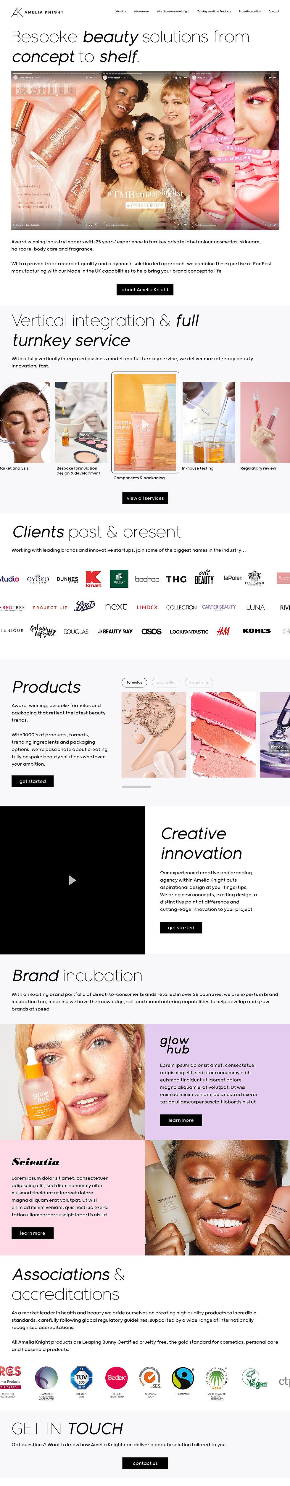
Due to the tight project timeline, we focused on creating a single high-fidelity mockup to convey the overall design direction, look and feel for the website. After receiving approval from management based on this mockup and the approved wireframes, I proceeded to build the entire site using Wix Studio.
Throughout the process, I communicated closely with all teams, ensuring timely receipt of image/video assets while constructing the site. We ran thorough testing on responsiveness, site speed, etc. and successfully launched the website in time for the event.
Users’ Perspective : Confusions on UX copy and clickable area/buttons.
Tech’s Perspective : Confusions on IA, user roles, and notifications settings.
DESIGN

BUILD WITH WIX STUDIO
aaa
Tech’s Perspective : Confusions on IA, user roles, and notifications settings.
RESULTS
After the launch of the new Amelia Knight website, the analytics show significant improvements across several key metrics.
-
Page views increased by 122%, from 6,558 to 14,568.
-
Site sessions grew by 118%, from 2,909 to 6,359.
-
Unique visitors more than doubled, rising by 141% from 2,020 to 4,872.
-
Form submissions saw a 23% increase, moving from 117 to 144.
These results demonstrate the positive impact of the website redesign in terms of higher user engagement and interaction.

Tech’s Perspective : Confusions on IA, user roles, and notifications settings.
View More Works
Boosting conversion rates and driving sales growth through improved user experience, visual consistency and brand identity.

Redesigned the one-stop restaurant management app, contributing to a 116% increase in restaurant subscriptions.

Exploring the user experience of end-to-end encryption in instant messaging.
